MAGIC STORY BRANDING + IDENTITY
Branding + Identity
Custom Typeface
Title Designs
Book Cover Design
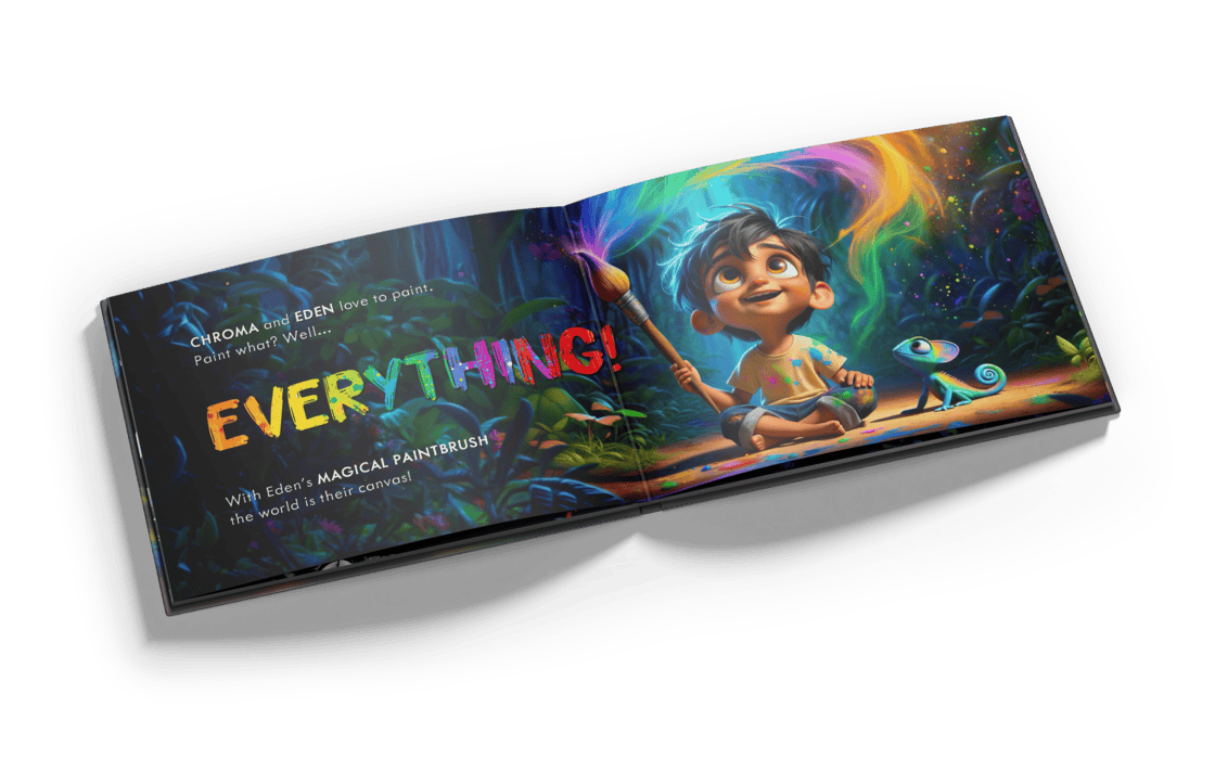
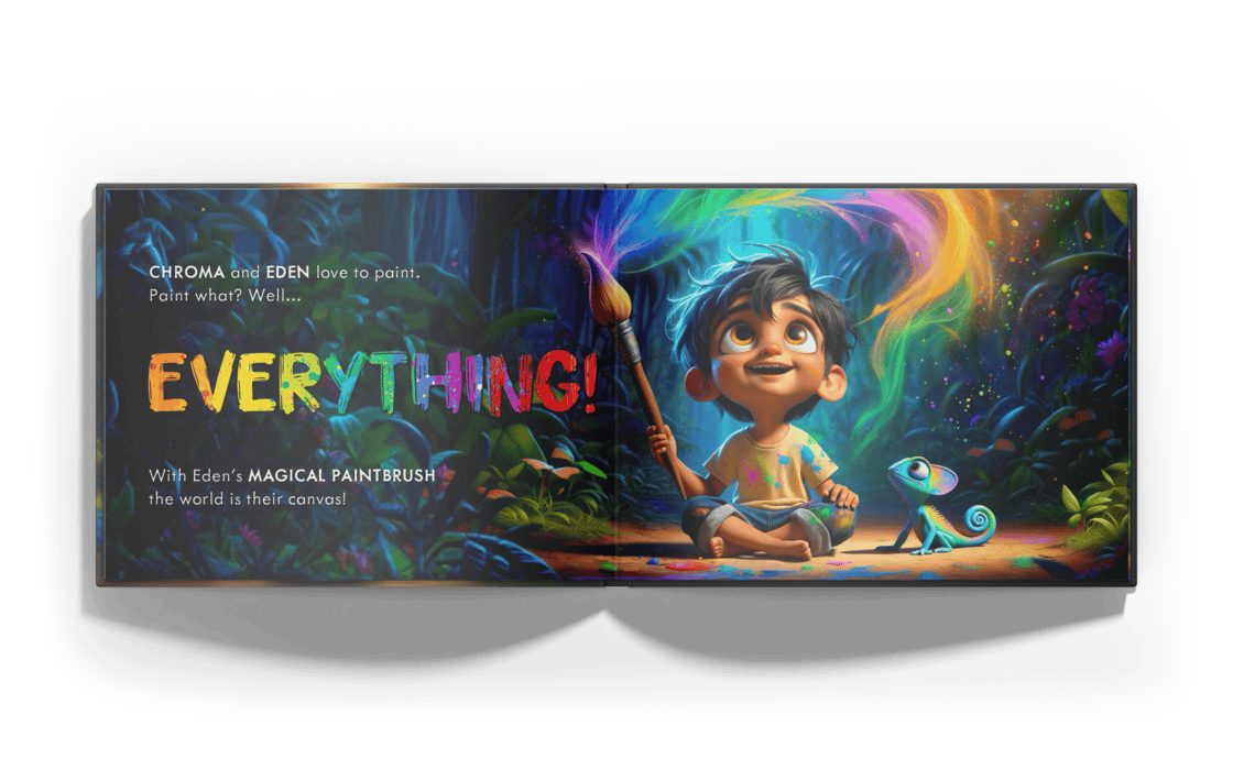
Interior Layout Design
The (Magic) Story:
Magic Story was founded in 2024 on the premise that children’s entertainment didn’t have to be complete digital junk food. When Erik Ober and Alex Hawkins emailed me their pitch we were instantly sold. Having kids ourselves, we know the crowded, messy world of children’s entertainment all too well from the consumer side. (That’s not to say there aren’t already amazing options out there for kids, but admittedly, they can be hard to find.) So that’s where our story begins, with an email and a quote request, as most fairytales often do…
The Wordmark:
So the wordmark ended up being something quite… well, magical. We landed on a stacked version, where all letters are lowercase, with the top line on a straight baseline, and a bottom with a stair-stepped layout to bring some playfulness into it. When we did this with the bottom line, it did something very interesting, the tail of the g lined up almost perfectly with the shoulder of the r. This happy accident inspired some extensive play on our end, and ultimately ended up in us presenting the logo where half of the ‘r’ is literally non-existent. It took some slight convincing, but ultimately the Magic Story team agreed that this version of the wordmark was something special.
The Brand Palette
Inspired by the classic rainbow (often seen in branding from children’s brands in the 80s), we leaned into a warm, instantly-recognizable palette that offered connection, but also allowed for plenty of playfulness. The overall goal being a palette that connected with kids and parents alike.
Typography
Custom Typeface
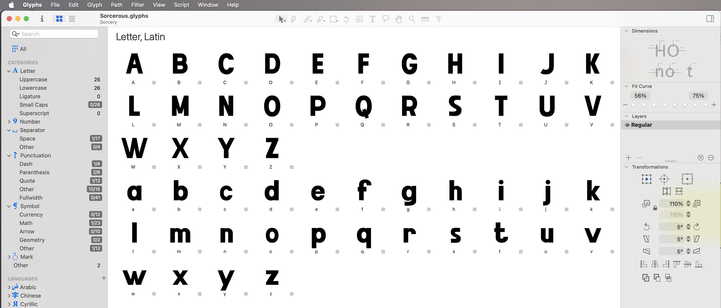
The brand’s launch saw the release of 24 original books in the children’s space, so one of our first thoughts when starting this project was that they needed a proprietary typeface for a multitude of reasons. In the end, we landed on a typeface superfamily based on what we called Sorcery - a bold sans-serif type that could be pushed, pulled, shaped and molded into whatever they might need down the road.
This typeface ended up being used on 23 of the 24 launch titles!
We knew having a proprietary font would be useful, but we had NO idea it would be THIS useful. We thought a brand font would help in a handful of ways in production, and it turned out it solved many problems we hadn’t even stumbled upon. Not to mention, our custom font greatly streamlined the design process for the book titles (it took approximately 8 weeks to design the titles, but we calculated it would have taken at least double that otherwise).
A truly magical type.
The Books
Do you know what it’s like to design 24 book titles in one-fell-swoop? We do. It’s a LOT, but the good part is it’s kind of like juggling where you’re keeping several things in the air at once so you don’t even have the wherewithal to realize what’s going on. We look back at these now and it’s extremely exciting to see them all in-action, but also it’s an added plus that we’re pretty darn proud of what came out of it.
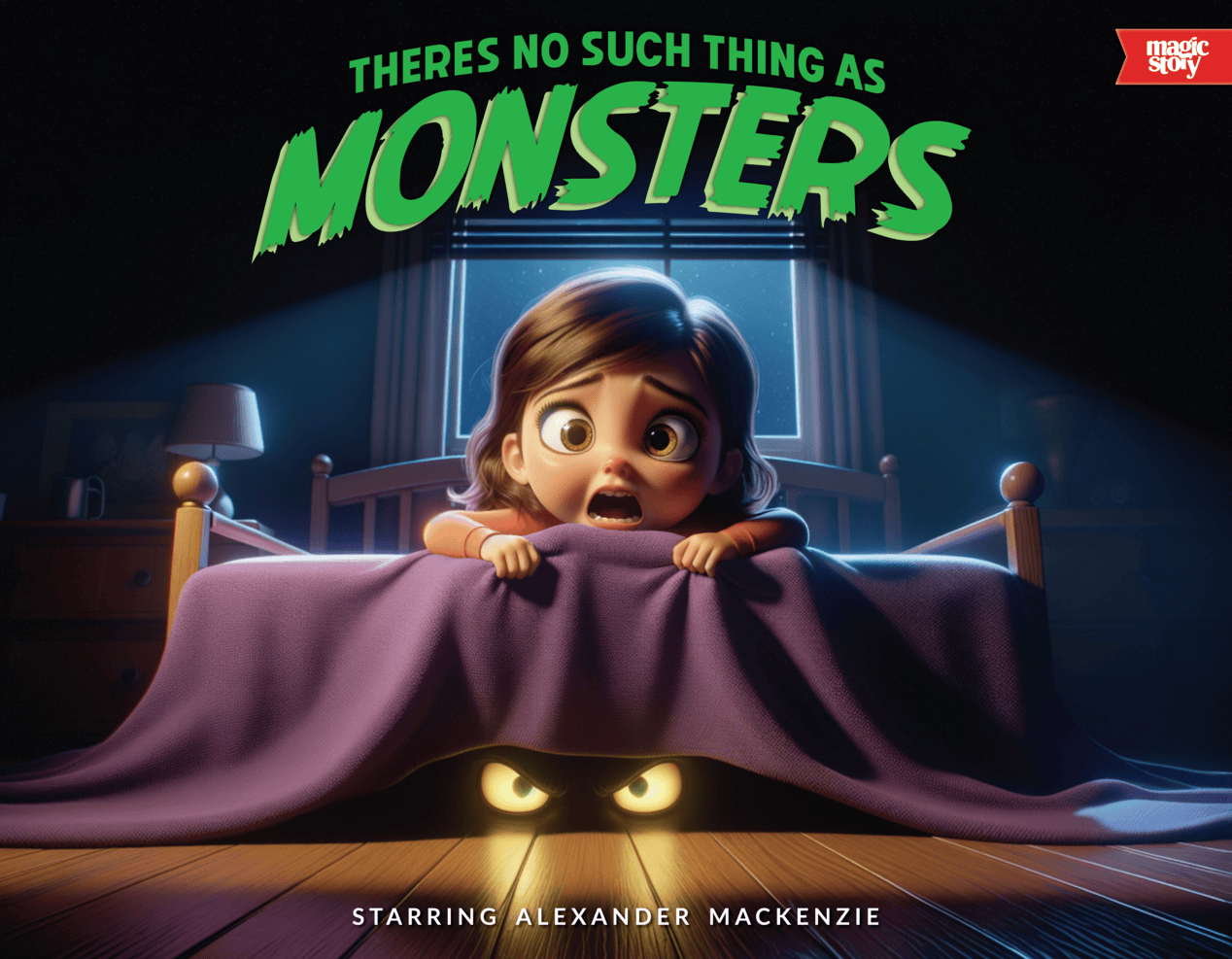
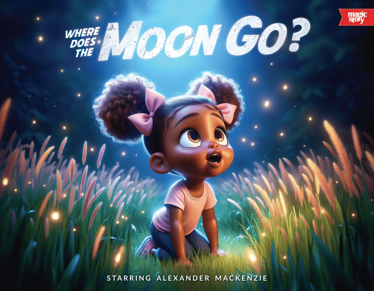
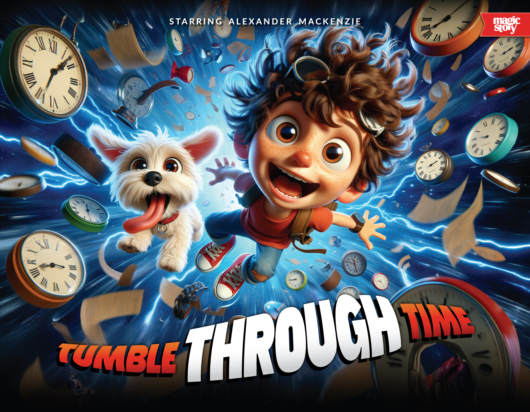
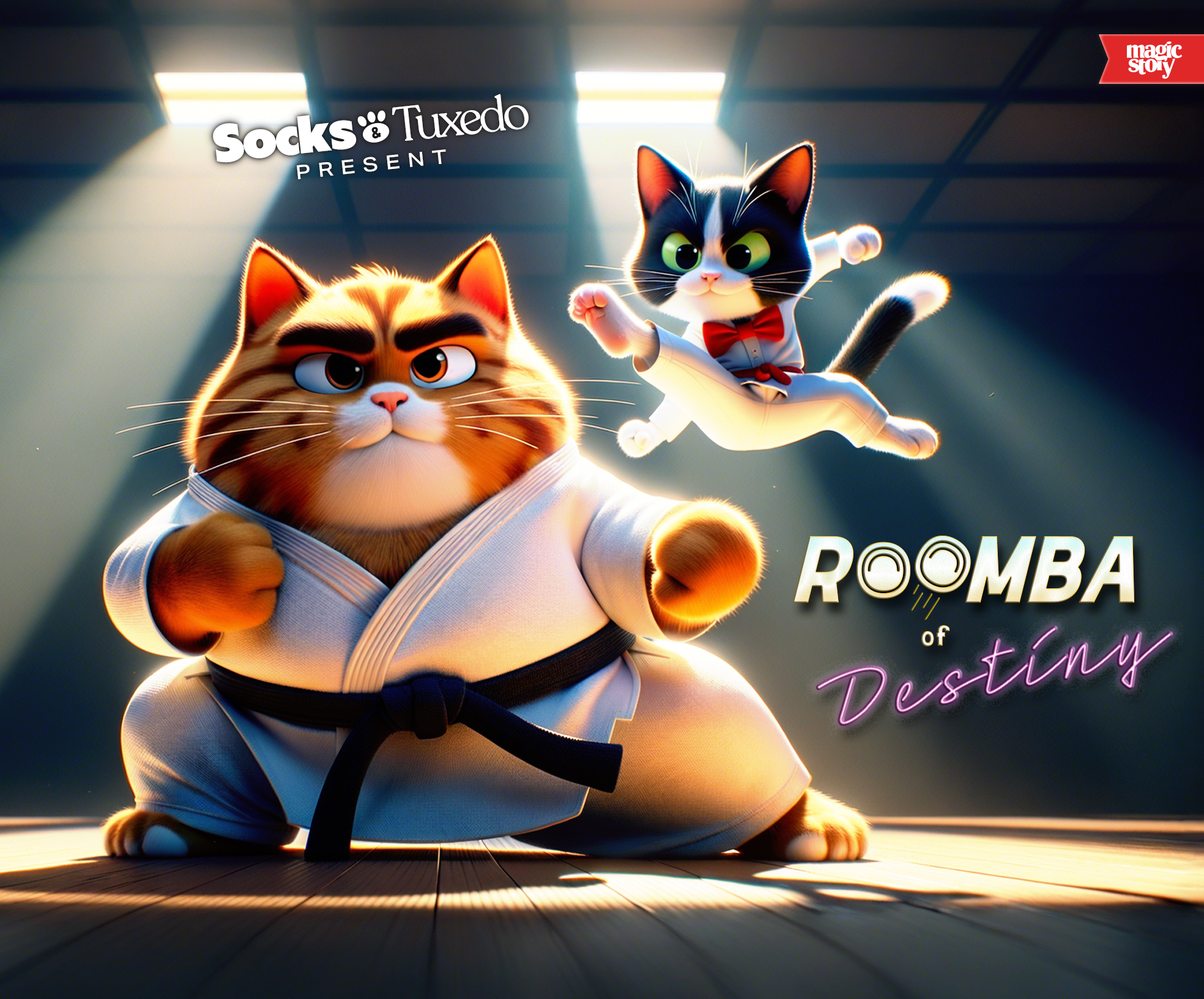
It’s also important to note that the Magic Story team handled the cover images themselves, which are the real heroes of these covers. It worked out nicely because their images and our titles created a marriage that elevated these to right where they needed to be visually.
The Cover Tab
The cover tab was created because we wanted a way to implement the wordmark on the book cover itself. What began as a logo stamp eventually morphed into a concept that resembled a bookmark, and wouldn’t ya know… that just felt so right.
The Spine Stamp
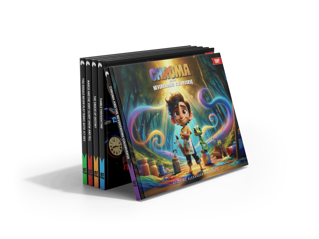
An early icon turned design element. The spine stamp came from an early logo exploration. We placed the silhouette of the concept on the spine in an early render and something about it just really nailed form/function, and it stuck all the way til the end. We wanted to see these on a shelf and immediately be able to pick them out from the sea of spines.












The Titles
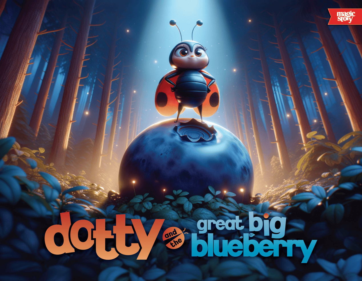
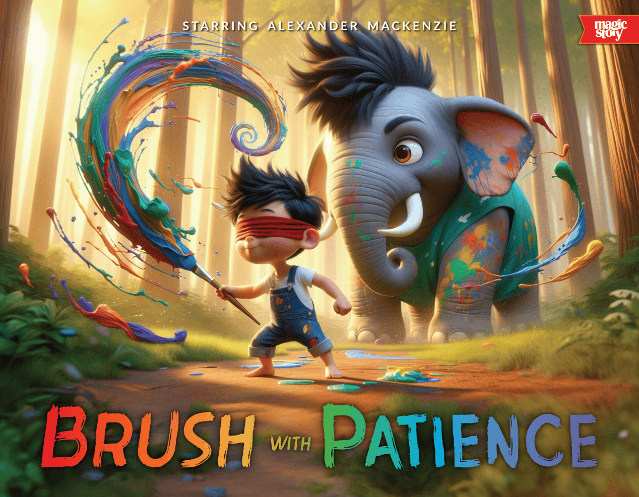
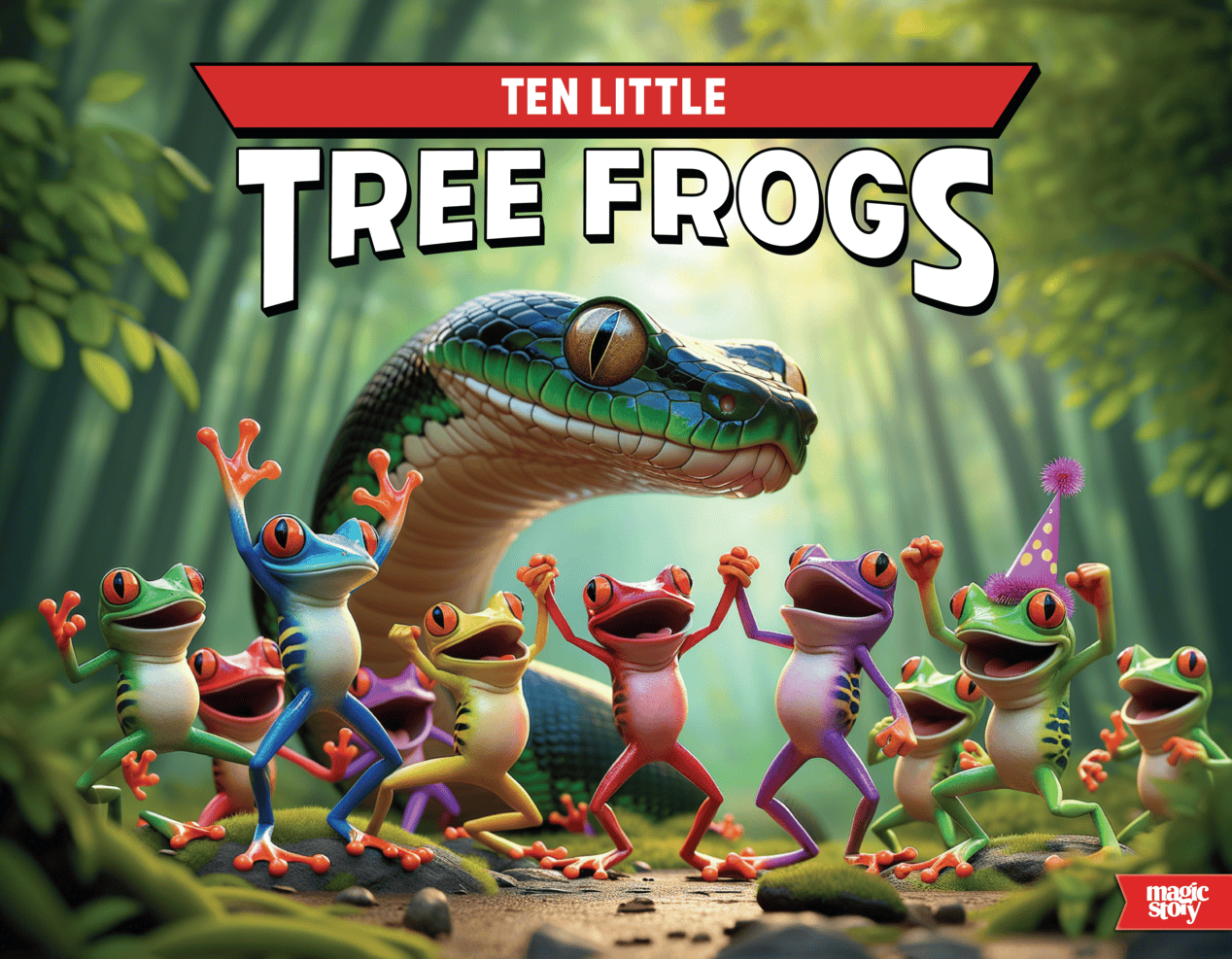
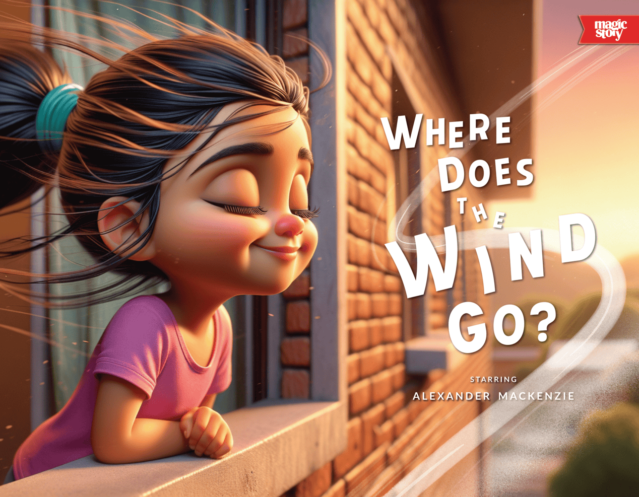
One exciting thing about this batch of titles is that they all legitimately stand on their own. There were absolutely some rules - we created a title design system that essentially grouped these into 3 separated options (top title, bottom title, and right title), and that ultimately helped guide the design process once the cover images were added.
The Title System
Here you can see the foundational design system at work that accidentally saved the day. We had never done a title project at this scale, but before the project even kicked off our design-intuition told us we need something systematic (and in the end that decision truly made the launch possible in the goal timeline).
The Full Scope:
Branding & Identity
Logo
Wordmark
Alternate Logo
Typography
Color Palette
Brand Guidelines
Custom Typeface
4 Individual Weights
Regular
Bold
Serif
Brush
Titles
Layout
Concept
Design
Render
Design System
Front Cover
Back Cover
Spine
Interiors
